Learn about our editorial policies and terms & conditions
- A radar chart compares multiple variables at once by plotting them on spokes that radiate from a center point.
- It's best for showing a profile (strengths vs weaknesses) across 5 to 8 metrics, not for precise value reading.
- Radar charts look cool, but they can also mislead (especially when you rely on filled areas or messy overlays).
- If you need accurate comparisons, use a bar chart or dot plot. If you need many items, use parallel coordinates or a heatmap table.
What Is a Radar Chart?
A radar chart puts several metrics on a single circular chart, with each one getting its own spoke radiating out from the center. You plot the values, connect the dots, and end up with a shape that represents how something performs overall. The shape is the entire point. Just keep in mind that the shape reflects both the data and the order of the variables. Radar charts are exceptionally good at answering questions like "Where are we strong?" or "What's clearly lagging behind?" Just don't expect accuracy down to the decimal, as comparing exact values is difficult due to the axes being at different angles. Radar charts focus on patterns rather than fine-grained precision.
You'll also see radar charts referred to as spider charts, web charts, star charts, radial charts, or Kiviat diagrams. Different names, but all the same idea.
Radar Chart[ˈrāˌdär CHärt]A radar chart is a data visualization that compares three or more quantitative variables by plotting them on evenly spaced axes radiating from a central point and connecting the values to form a polygon.
What Is the Radar Chart Used For?
Radar charts work well when you want a big-picture view across several metrics. They're great for spotting strengths and gaps, but they're not the right tool for comparing small numerical differences.
Use a radar chart when you want to:
- Compare multiple metrics for the same item
- Compare a small number of items across the same variables
- Spot strengths, weaknesses, and gaps quickly
- Highlight outliers or standout dimensions
- Show overall balance or imbalance across categories
Typical examples include product feature comparisons, skill assessments, performance reviews, survey category scores, or before-and-after snapshots of the same process.
How to Read a Radar Chart
Start with the shape, rather than the numbers. A balanced, rounded shape usually indicates consistency. Big spikes or drop-offs usually point to strengths or problem areas, which is where you'll find the most helpful insights. Compare values along the same axis, not the overall area, as the area can grow with the square of linear values. Radar charts are read by distance from the center, even though your brain wants to compare size. That instinct is wrong here, and it's where people get misled.
Check the scale and the order of the axes. All axes should use the same range, and the variable order should be intentional, with related variables kept together and axes arranged to minimize "spikiness". You can make the same data look better or worse just by rearranging the spokes.
One last reminder: connected does not mean related. Radar charts draw lines to form a shape, not to imply relationships between variables.
Parts of a Radar Chart
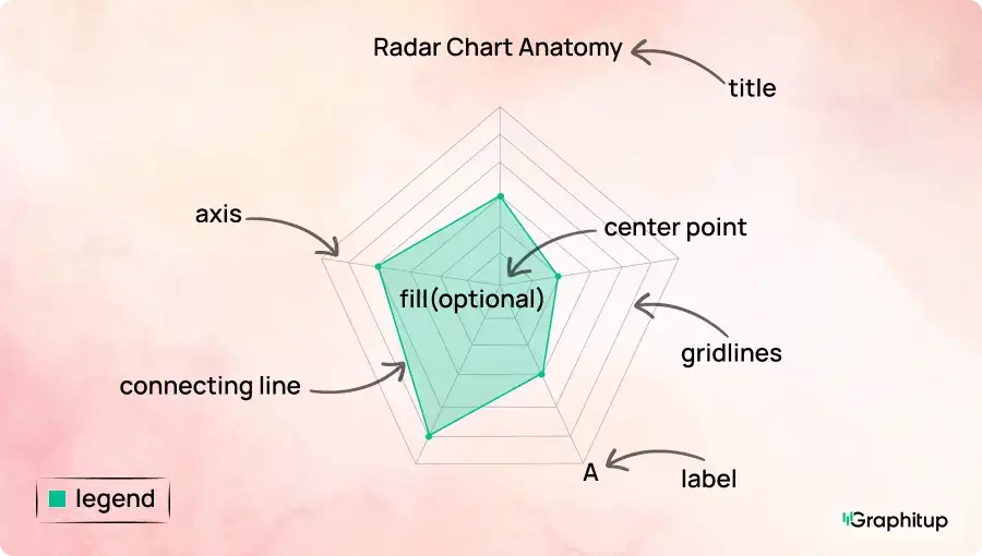
Every radar chart has the following core components:
1. Center point
The starting point for all axes, usually representing zero or the minimum value.
2. Axes (spokes)
Lines that radiate outward from the center, with each axis representing a variable or metric.
3. Gridlines
Concentric rings that help estimate values as distance increases from the center.
4. Data points
Points plotted along each axis to show the value for that variable.
5. Connecting line
Lines that connect the data points to form the polygon representing the data profile.
6. Fill (optional)
A shaded area inside the polygon used to emphasize shape, often with transparency to avoid distortion.
7. Labels and legend
Text that identifies each axis and explains which series each shape represents.
Radar Chart Best Practices and Common Mistakes
Radar charts are easy to misuse. Small design choices can quietly change the story they tell, especially because the viewer is interpreting shape and distance rather than exact numbers.
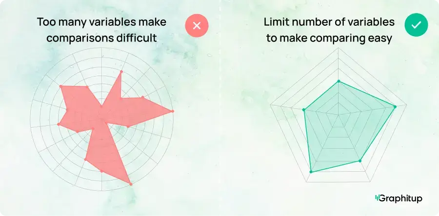
Bad: Too Many Variables Create Visual Noise
Radar charts fall apart quickly as more variables are added. Once you get past about 8 to 10 axes, labels start colliding, angles get cramped, and patterns become harder to see. Beyond 12 data points, the chart usually stops being readable altogether.
Good: Limit the Number of Variables
Radar charts work best with a limited number of variables, usually around five to eight. With fewer axes, the shape becomes clearer and easier to interpret.
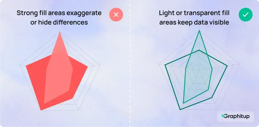
Bad: Filled Areas Exaggerate Differences
Filled radar charts can make small differences look much bigger than they actually are. The eye naturally compares area, even though radar charts encode values by distance from the center.
Good: Use Light or Transparent Fills (or None at All)
If fills are used, they should be subtle and very transparent (10-20% opacity) and be used to help viewers track points belonging together. In many cases, simple lines with markers communicate differences more honestly and avoid visual exaggeration.
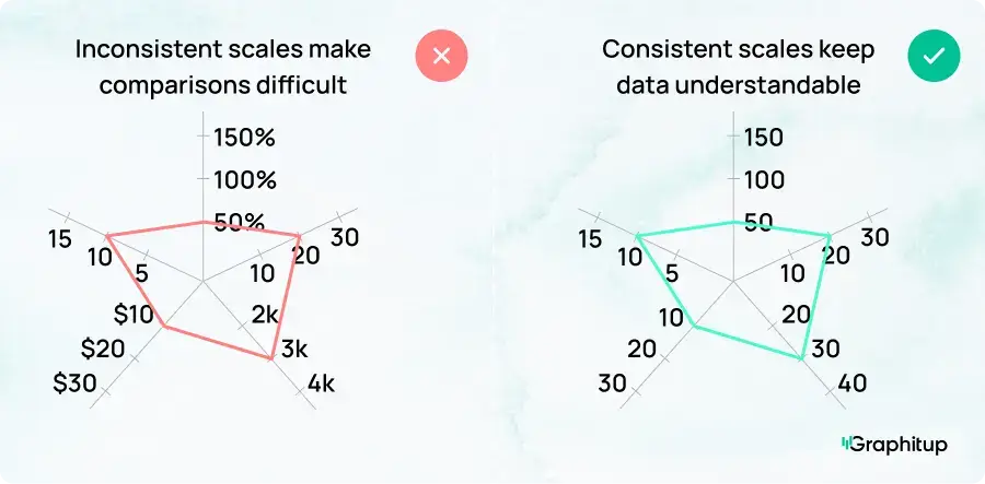
Bad: Inconsistent or Misleading Scales
When each axis uses a different scale, the chart looks dramatic even if the data is not.
Good: Use Consistent, Meaningful Scales
Using the same scale on every axis makes the chart easier to understand and more accurate.
Bad: Too Many Layers or Groups Overlap
Adding too many categories, groups, or series to the same radar chart makes it nearly impossible to read. Shapes overlap, colors blur together, and even with transparency, it becomes hard to tell which values belong to which group.
Good: Limit the Number of Groups Shown at Once
Radar charts work best with one to three groups on a single chart. If you need to compare more categories, use multiple charts with the same axes instead of stacking everything into one.

Advantages and Disadvantages of Radar Charts
Radar charts are popular because they pack a lot of information into a compact, visually engaging format. At the same time, they rely heavily on visual perception, which means they can mislead just as easily as they can clarify.
- Visualizes multiple variables in a single chart.
- Makes strengths and weaknesses easy to spot.
- Highlights outliers and standout dimensions.
- Useful for comparing profiles like skills or features.
- Compact way to summarize several metrics.
- Visually engaging and quick to scan.
- Shows general balance or imbalance for small datasets.
- Difficult to read exact values.
- Area and shape can distort perception.
- Becomes cluttered with too many variables.
- Overlapping series are hard to compare.
- Arbitrary axis order can create misleading patterns.
- Can imply relationships between unrelated variables.
- Not suitable for large datasets or precise comparisons.
How to Make a Radar Chart
You can build a radar chart a few different ways, but the right approach depends on how fast you need it, how polished it needs to look, and whether the data will change.
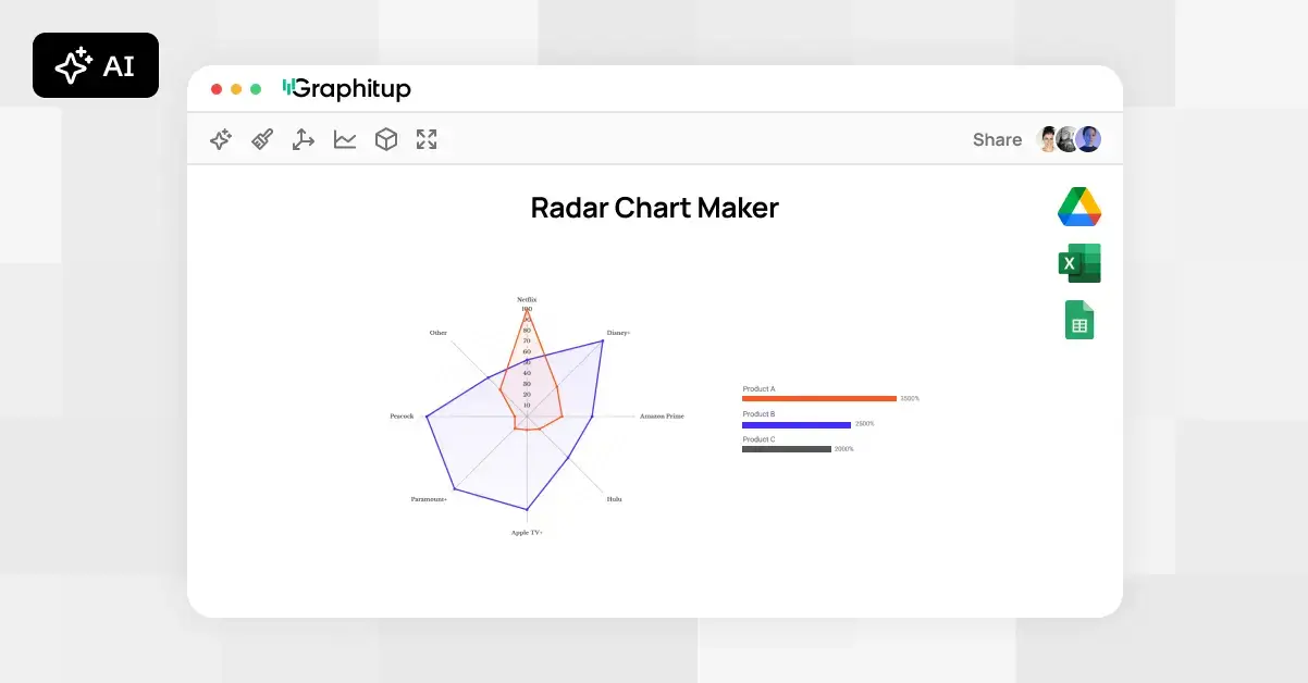
Make a Radar Chart in Graphitup
Although you can build a radar chart in most spreadsheet tools,
Graphitup is designed to handle the practical work quickly, especially when you don't want to start from a blank canvas.
Graphitup gives you multiple different starting points:
To create a radar chart:
- Choose a radar chart template or start from scratch.
- Upload data from Excel, Google Sheets, or CSV, or enter it manually.
- Define your variables and ensure all metrics use a consistent scale.
- Adjust axis ranges, labels, colors, and fills to match your use case or brand.
- Export a high-resolution image or embed the chart directly into reports or dashboards.
The free plan includes 5 charts and up to 500 monthly views. The creator and growth plans add real-time data syncing, higher view limits, unlimited AI credits, access to the full template database and the ability to remove Graphitup branding for a cleaner, professional finish.
Alternatives to Radar Charts
Radar charts are useful for comparing multiple metrics at once, but they're not always the clearest option. Depending on what you're trying to show, a simpler or more direct chart can often do a better job.
If a radar chart isn't working for your data, these are better alternatives:
- Bar charts when you need clean, precise comparisons across categories
- Line charts when the data changes over time
- Scatter plots when you want to explore the relationship between two numeric variables
Create Professional Radar Charts With Graphitup
Radar charts are powerful when they're used for the right job. They're great for comparing strengths and weaknesses, summarizing performance across multiple metrics, and giving people a fast, intuitive read on complex data. Used well, they turn messy tables into something you can actually think with.
Graphitup is built to make radar charts the right way, by default. You can start with the Radar Chart Maker to build a clean chart from scratch or from a template, or use the AI Chart Maker to generate a ready-to-edit radar chart just by pasting your data and describing what you want. Either way, you spend less time formatting and more time actually understanding the data.
You can sign up for free and start creating radar charts right away, with embeddable charts and enough flexibility to handle real work. When you're ready for live data, higher limits, or a fully branded look, upgrading is simple.
 Online Radar Chart Maker - Free, No Signup
 How to Make a Radar Chart in Excel
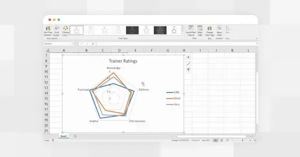 How to Make a Radar Chart in Google Sheets