Learn about our editorial policies and terms & conditions
Making a radar chart in Google Sheets is a common choice for those who already use Google Suite for most of their tasks. It's browser-based, easy to share and works well when multiple people need access to the same data. If your chart is tied to a shared Google Sheet, then it can be a convenient starting point. The convenience does come with tradeoffs, though. Radar charts in Google Sheets might be quick to create, but they don't offer much control once you get past the basics.
If your goal is a clean, well-designed radar chart that's easy to reuse or share outside of Sheets, a dedicated charting tool like Graphitup will usually get you there faster.
To create a radar chart in Google Sheets:
- Enter your data into a table.
- Select the full data range.
- Click Insert, then choose Chart.
- In the Chart Editor, open the Chart type dropdown.
- Scroll to Other and select Radar chart.
- Use the Setup and Customize tabs to adjust axis ranges, colors, labels, and gridlines.
- Download the chart as an image or embed it into documents or presentations.
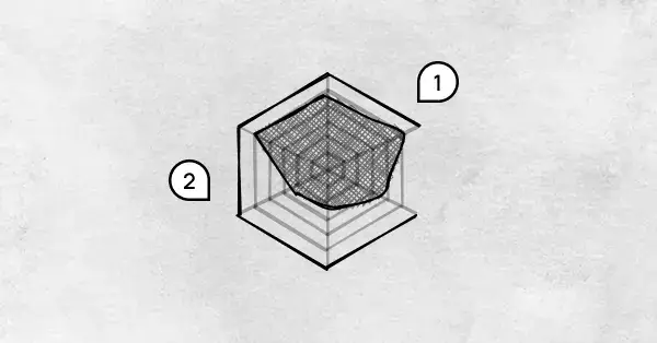
Google Sheets makes it easy to create a radar chart, but harder to create a good one. Styling options are limited, scaling has to be managed manually, and there's little guidance on best practices. Adding multiple groups quickly leads to overlap and clutter, with not a lot of support available to fix it.
Graphitup is what you reach for when you're tired of fiddling with charts. Instead of manually editing scales, spacing, and overlaps, you start with something that already looks right and stays readable even as data changes. And that matters a lot with radar charts.
You can reuse the same chart layout across datasets, update values without reformatting, and export or embed charts that look consistent wherever they're shared. If you want to skip setup entirely, the AI Chart Maker can generate a clean radar chart from your data in one step and let you refine it from there.
Google Sheets is fine when the chart lives inside the spreadsheet, but Graphitup makes more sense when the chart needs to stand on its own.
 Radar Chart Guide
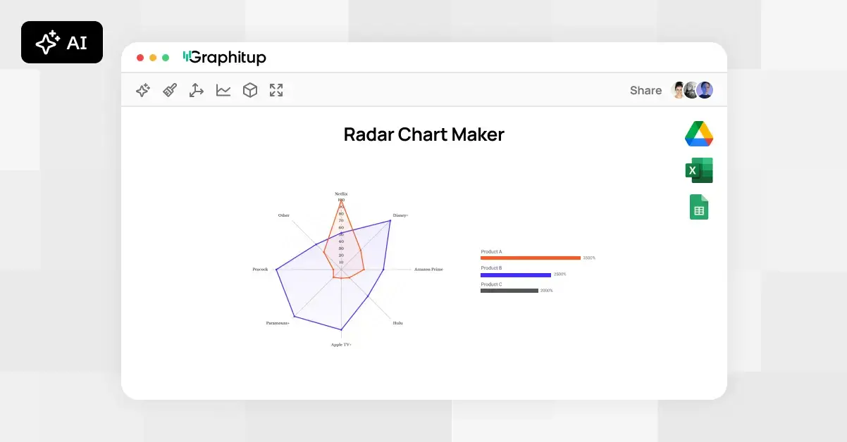 Online Radar Chart Maker - Free, No Signup
 How to Make a Radar Chart in Excel