Learn about our editorial policies and terms & conditions
Excel is often the first place people turn when they need a radar chart. It's familiar, already installed, and good enough for quick, static visuals. If your goal is a one-off chart for an internal doc or slide deck, Excel can get you there. That said, Excel radar charts hit their limits quickly because formatting is manual, and comparisons get messy.
Excel makes sense if you already live in spreadsheets and don't want to learn a new tool. If your workflow starts and ends in Excel, and the chart is just a quick visual along the way, staying put can be the path of least resistance. But if the chart itself matters, then more tailored tools, like Graphitup , will be more effective.
To create a radar chart in Excel:
- Enter your data into a table, with variables in the first row and values for each dataset in the rows below.
- Highlight the entire data table.
- Go to the Insert tab in the Excel ribbon.
- Select Radar Chart from the chart options.
- Choose one of the available styles: standard radar, radar with markers, or filled radar.
- Adjust axis scales, labels, colors, and titles to improve readability.
- Format the chart to reduce clutter, especially if you're comparing more than one series.
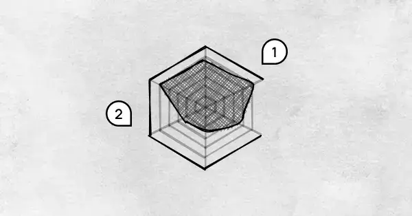
Excel technically supports radar charts, but it doesn't help you use them well. Scaling has to be handled carefully by hand. Small design choices can change how the chart reads, and Excel won't warn you when that happens. Templates aren't reusable in a meaningful way, and keeping charts consistent across reports takes more effort than it should. Most importantly, Excel charts are static. If the data changes, you're back to editing, reformatting, and double-checking everything again.
Graphitup is built specifically for charts like this. Radar charts follow best practices by default, so scales stay consistent, and layouts don't fall apart as your data changes. It's much easier to control how many variables and layers you're showing, which keeps charts readable instead of overwhelming.
Instead of rebuilding charts every time, you can reuse templates, update data without reformatting, and export or embed charts that look the same everywhere you use them. If you want to move even faster, the AI Chart Maker can generate a clean radar chart from your data in one step, then let you tweak it from there.
 Radar Chart Guide
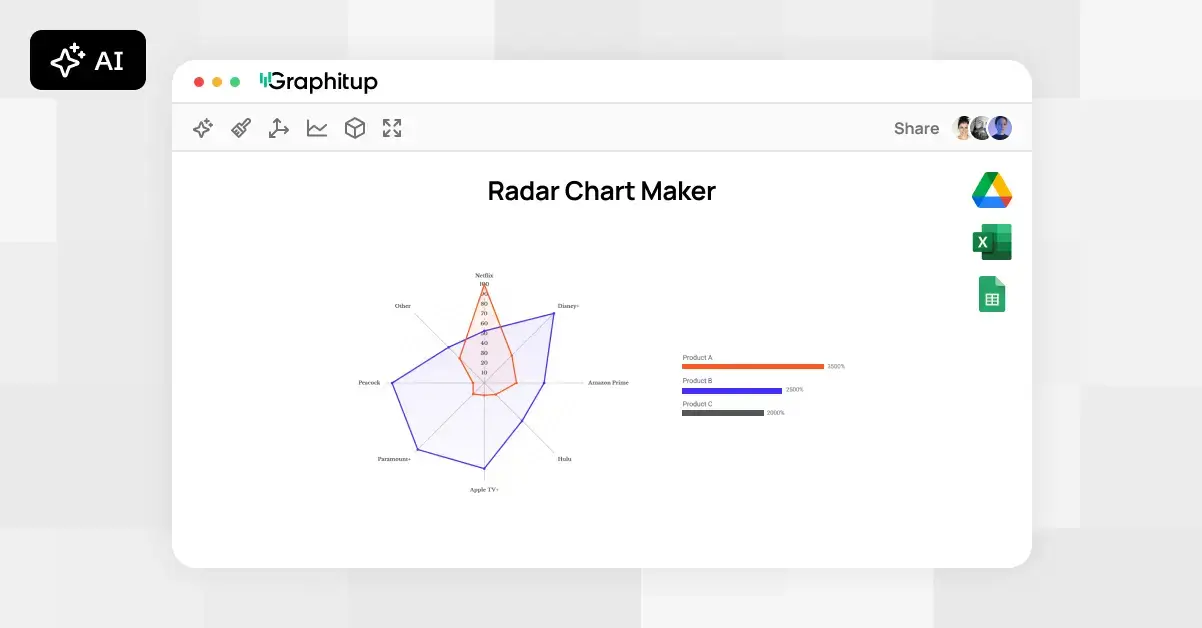 Online Radar Chart Maker - Free, No Signup
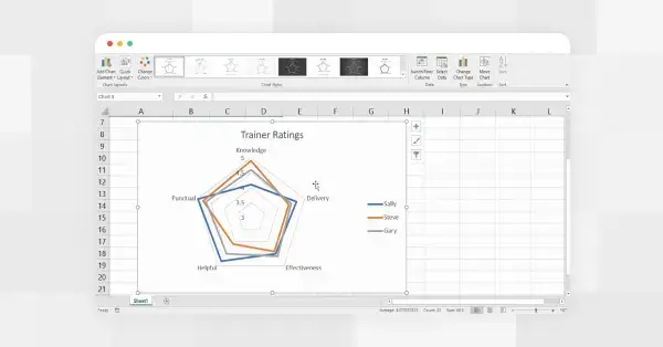 How to Make a Radar Chart in Google Sheets