Learn about our editorial policies and terms & conditions
- Scatter plots show the relationship between two numeric variables.
- They are great for spotting trends, correlations, clusters, and outliers.
- Scatter plots show correlation, not causation.
- Trendlines can help clarify patterns, but they can also mislead if overused.
- Poor scaling and overplotting are the most common ways scatter plots go wrong.
What Is a Scatter Plot?
A scatter plot, sometimes called a scatter chart, XY chart, or dot plot, displays data points on a two-dimensional coordinate system. Each point represents a single observation, with its horizontal position based on the x value and its vertical position based on the y value.
With one variable being represented by the x-axis and the other by the y-axis, the scatter plot setup makes it easier to see whether changes in one variable tend to line up with changes in the other, or if they really don't. When looking at relationships between dependent and independent variables, the x-axis typically represents the independent variable, whereas the y-axis represents the dependent variable.
Unlike bar or pie charts, scatter plots do not summarize or group values. They show the raw distribution of the data, which is exactly why they are so useful when you are trying to understand what is really going on beneath the surface.
Scatter Plot[ˈska-tər ˈplät]A scatter plot is a chart that shows the relationship between two numeric variables by plotting individual data points on a horizontal x-axis and a vertical y-axis.
When to Use a Scatter Plot
Scatter plots work best when the real question is "are these two things actually related?", not "what's the total?" If you're trying to understand how one number moves when another one changes, this is usually the chart you want.
Use a scatter plot when you want to:
- See whether two variables are related at all
- Identify positive, negative, or no correlation
- Spot outliers or unusual data points
- Find clusters or natural groupings
- Explore whether one variable might help predict another
Typical examples include marketing spend versus conversions, temperature versus energy usage, study time versus test scores, or product usage versus retention.
Scatter plots are a poor choice when your data is categorical, when you're just comparing totals, or when you're trying to show how a whole is divided up. If that's your situation, reach for a bar chart, line chart, or pie chart instead. They'll do the job faster and won't make the reader work harder than they need to.
How to Read and Interpret a Scatter Plot
Interpreting a scatter plot is less about reading individual points and more about understanding the overall pattern they form together.
Start by looking at the direction of the relationship. If the points generally move upward from left to right, that suggests a positive correlation. If they move downward, the correlation is negative. If the points are scattered without any clear direction, there may be little or no relationship between the variables.
Next, look at the strength of the relationship. When points cluster tightly along a line or curve, the relationship is stronger. When they are spread out, the relationship is weaker, even if a general trend is still visible. Pay attention to the shape of the pattern. Not all relationships are linear. Curves, waves, or bends can still be meaningful and are often where the most interesting insights show up.
Finally, watch for clusters, gaps, and outliers. Clusters can suggest segments in the data, gaps may point to thresholds or missing values, and outliers often deserve a closer look. They might be errors, rare events, or the most important data points in the entire chart.
One rule always applies: correlation does not imply causation. A scatter plot can show that two variables move together, but it cannot tell you why.
Parts of a Scatter Plot
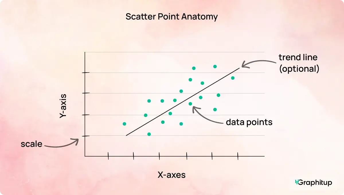
Every scatter plot has the following core components:
1. X-axis
Shows the independent variable, such as time, spend, or usage.
2. Y-axis
Shows the dependent variable that changes in response to the x-axis.
3. Data points
Dots representing individual observations, positioned by their x and y values.
4. Scale
The numeric range on each axis that determines how relationships appear.
5. Labels
Text that explains what each axis measures and, when needed, the units.
6. Trendline (optional)
A line summarizing the overall direction of the relationship.
Scatter Plot Best Practices and Common Mistakes
Scatter plots are powerful, but small design choices can quietly change the story they tell. The examples below highlight the most common mistakes and how to fix them.
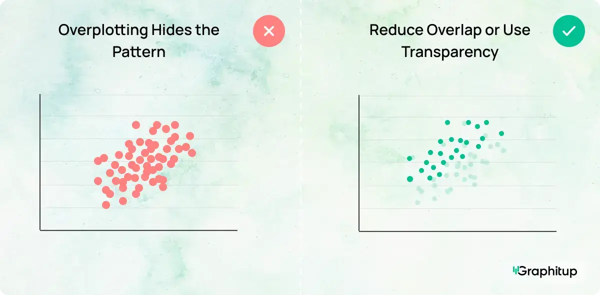
Bad: Overplotting Hides the Pattern
When too many points overlap, it becomes hard to see density, clusters, or trends. The structure of the data gets lost in the noise.
Good: Reduce Overlap or Use Transparency
Smaller points, added transparency, or sampling the data can make dense areas readable again. Once overlap is reduced, the relationship becomes much easier to interpret.
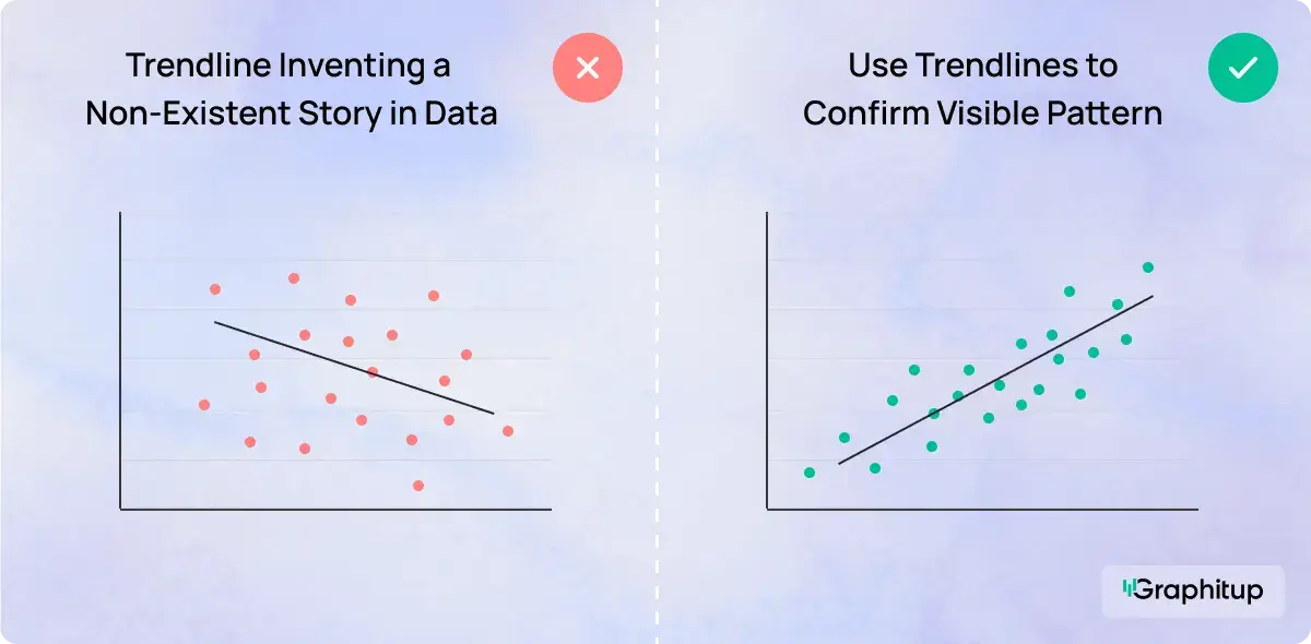
Bad: Forcing a Trendline Where None Exists
Adding a trendline to random data suggests meaning that is not there. It encourages the viewer to see a pattern that simply does not exist.
Good: Use Trendlines Only When They Add Clarity
Trendlines should confirm visible patterns that you can already see, not invent a story. If the data is scattered without direction, skip the line.
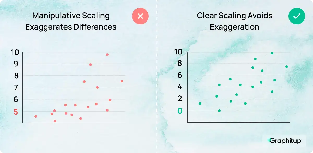
Bad: Misleading Axis Scaling
Stretching or compressing axes can make weak relationships look strong or strong relationships look insignificant.
Good: Use Honest, Consistent Scales
Axis ranges should reflect the data accurately (which may not include zero necessarily). When the scale is honest, the visual impression matches the actual relationship.
Using Trendlines and Color in Scatter Plots
Trendlines and color can make a scatter plot easier to understand, but only when they actually help. A trendline works best when a pattern is already visible. It gives the eye something to follow and makes the overall direction easier to see. When the data is scattered randomly, adding a line usually does more harm than good.
Color is often used to separate points into groups, like regions, product types, or customer segments. When done well, this makes comparisons clearer without adding clutter. When overdone, it turns the chart into visual noise. If the color does not answer a specific question, it probably does not need to be there. Usually, 5-7 color categories are used.
Sometimes size is used to add a third number to the chart. Larger dots represent larger values, which turns the scatter plot into a bubble chart. This can work, but only when size adds real context. If dot size starts competing with position for attention, it is usually time to simplify. You can explore this option further with the Bubble Chart Maker.
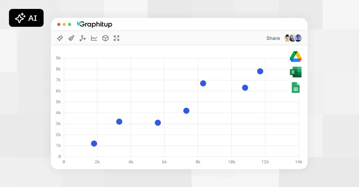
How to Make a Scatter Plot
Although you can build a scatter plot in most charting tools,
Graphitup is designed to handle the practical work quickly and effectively, especially when you do not want to start from a blank canvas.
Make a Scatter Plot in Graphitup
Graphitup gives you several flexible starting points:
How it works:
- Choose a scatter plot maker or template that fits your use case.
- Upload data from CSV, Excel, or Google Sheets, or enter it manually.
- Adjust axes, labels, colors, point size, and gridlines.
- Add a trendline or color grouping if it helps clarify the story.
- Export a high-resolution image or embed the chart in dashboards and reports.
If you use the AI option, you can describe the chart you want, paste your data, and let Graphitup generate a ready-to-edit scatter plot in one step.
Examples of Scatter Plots
Scatter plots are commonly used to analyze relationships such as:
- Advertising spend versus conversions
- Temperature versus energy consumption
- Product usage versus retention
- Study time versus exam scores
- Height versus weight
Access our full template library here.
Related Chart Types
If a scatter plot is not the right fit, consider these alternatives:
- Line charts for trends over time
- Bar charts for category comparisons
- Bubble charts for three numeric variables
Choosing the right chart type matters just as much as designing it well.
Create Better Scatter Plots With Graphitup
A good scatter plot makes relationships visible without forcing conclusions. It shows how variables move together, where patterns emerge, and where the data breaks expectations, without clutter or distortion.
Graphitup is built to help you get there faster. You can start with the Scatter Plot Maker, extend your analysis with bubble charts, or let the AI Chart Maker generate a clean first draft. Templates follow best practices out of the box, so you can focus on understanding the data instead of wrestling with formatting.
If you want scatter plots that look polished, stay honest, and actually help people see relationships clearly, start with
Graphitup and turn raw data into insight in just a few steps.
 Online Scatter Plot Maker - Free, No Signup
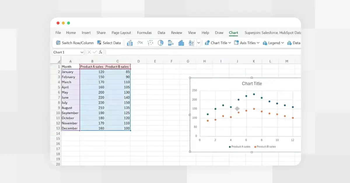 How to Make a Scatter Plot in Excel
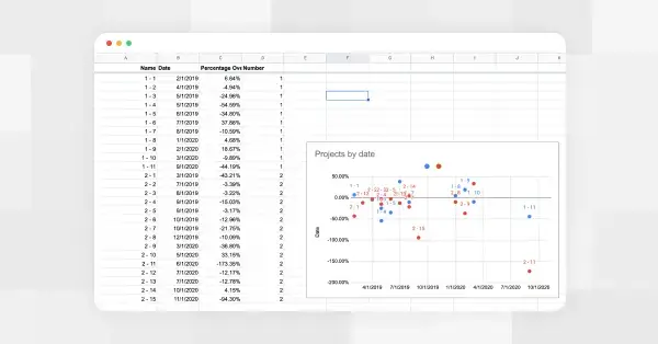 How to Make a Scatter Plot in Google Sheets