Learn about our editorial policies and terms & conditions
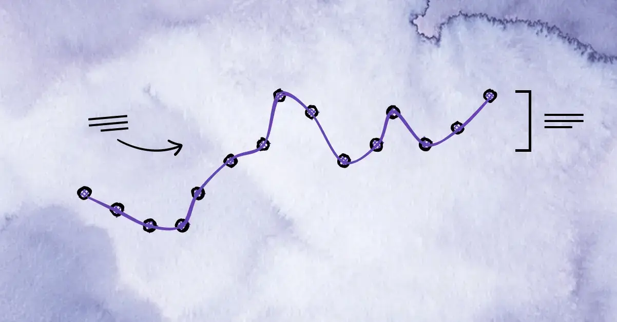
Line graphs are used to show change over time, but there's more than one way to structure them. The three most common types you'll encounter are simple line graphs, multiple line graphs, and compound (stacked) line graphs. Each serves a different purpose, and choosing the right one makes the data much easier to read and interpret.
Simple Line Graph
A simple line graph shows how a single variable changes over time. One dataset, one line.
Use a simple line graph when:
- You are tracking one metric
- You want the trend to be immediately clear
- Comparison is not the goal
This is the most straightforward type of line graph and often the best place to start. It works well for things like monthly revenue, temperature changes, or user growth over time.
Multiple Line Graph
A multiple line graph displays two or more related datasets on the same set of axes. All lines share the same x-axis, making it easier to compare trends over time.
Use a multiple line graph when:
- You want to compare trends between categories
- All variables use the same units or scale
- The number of lines stays manageable
This format is common for things like product performance comparisons, regional trends, or year-over-year data. As a rule, fewer lines lead to clearer charts.
Compound or Stacked Line Graph
A compound or stacked line graph shows how multiple components contribute to a total over time. Each line builds on the one below it, so the top line represents the overall total.
Use a compound line graph when:
- The total value matters
- You want to show how parts change within that total
- Composition over time is the focus
This type of chart is useful for visualizing breakdowns, such as traffic sources or budget allocation, as long as the structure stays consistent.
Choosing the Right Type of Line Graph
Most confusion around line graphs comes from using the right data with the wrong structure. If the goal is clarity, simpler formats usually win. If comparison or composition is important, multiple or compound line graphs are more appropriate. The key is matching the chart type to the question you are trying to answer.
If you're creating line graphs regularly, Graphitup makes it easier to work with different types of line graphs without rebuilding charts every time. You can switch between simple, multiple, and compound line graphs, reuse templates, and keep scales and formatting consistent as data changes.
 Line Chart Guide
 Online Line Graph Maker - Free, No Signup
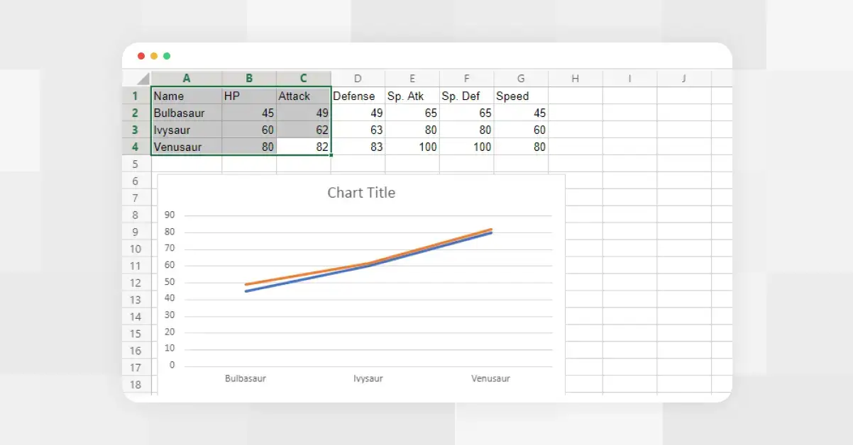 How to Make a Line Graph in Excel
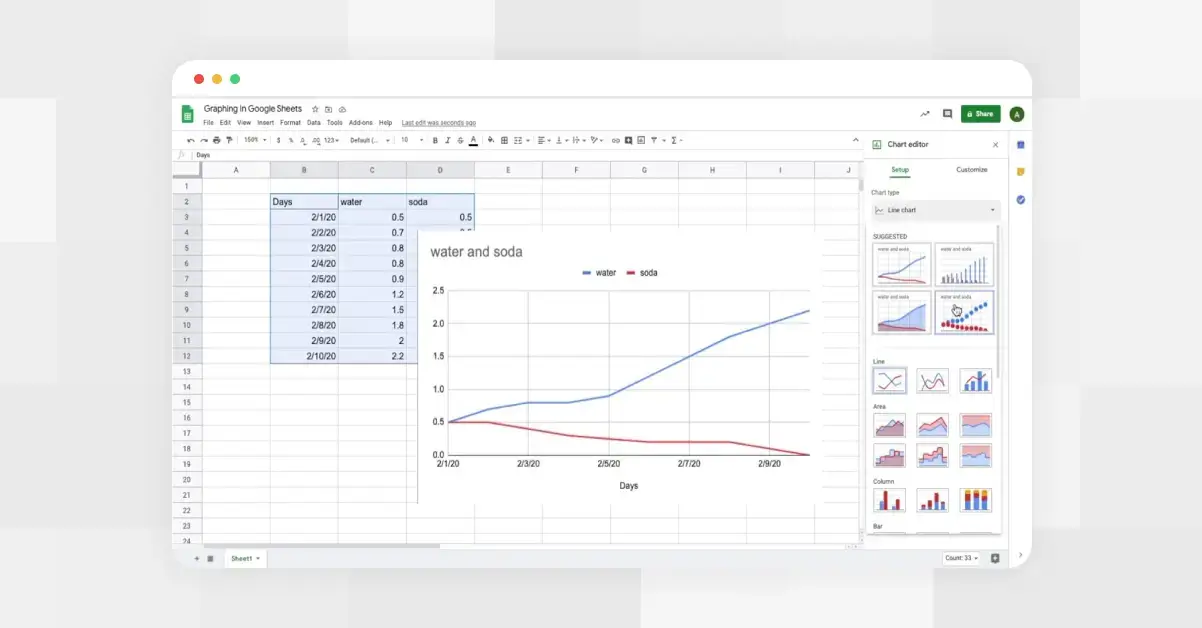 How to Make a Line Graph in Google Sheets
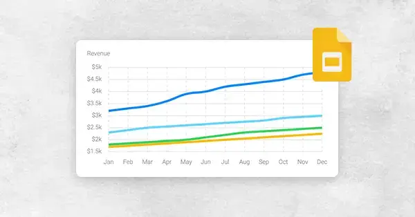 How to Make a Line Graph in Google Slides, in 6 Quick Steps
 Bar vs Line Graph: When to Use Them For Maximum Impact