Learn about our editorial policies and terms & conditions
Google Slides lets you add line graphs directly to a presentation, but the chart itself is always connected to a spreadsheet. Slides handles placement and layout. Google Sheets handles the data. Once you know where to click and how that connection works, the process is straightforward. Here is how to make a line graph in Google Slides.
Step 1: Insert a chart
Open your presentation and go to the slide where you want the chart. Click Insert, then Chart, and choose Line. Google Slides will place a line graph on the slide using sample data. At this point, the chart exists, but it is not yet connected to your own data.
Step 2: Open the data source
Click once on the chart. A small toolbar will appear in the top right corner of the chart. Click the link icon or the three vertical dots menu and choose Open source. This opens the linked Google Sheet that controls the chart's data. That spreadsheet is where all data entry and structural changes happen.
Step 3: Edit the data in Google Sheets
In the Google Sheet, replace the placeholder values with your own data. The first column controls the x-axis, most often dates or time-based values. Each additional column represents a separate line on the graph. Column headers are used for the chart legend. As you edit the data, the chart updates automatically in Google Slides.
Step 4: Update the chart in Google Slides
If the chart does not update immediately, return to Google Slides and click Update on the chart toolbar. This refreshes the visual to reflect the latest data from the linked spreadsheet. As long as the chart remains linked, future data changes in Sheets can be pulled into the slide.
Step 5: Customize the line graph
You can adjust how the chart looks directly in Google Slides. This includes resizing the chart, moving it on the slide, and changing basic visual properties like colors and titles. More detailed formatting, such as axis settings or series behavior, needs to be done in Google Sheets. Customization affects appearance, but not the underlying data.
Step 6: Resize and position the chart
Once the chart looks right, resize it and position it on the slide as needed. Google Slides treats the chart as a single object, so it can be aligned, grouped, and layered like other slide elements.
Create more versatile line graphs with Graphitup
Google Slides works well for placing a line graph on a slide, but managing charts through linked spreadsheets can become repetitive, especially when data changes often or charts are reused across decks.
Graphitup is designed for creating line graphs directly from data and turning them into polished visuals. Charts can be exported or embedded as presentation-ready graphics that stay in sync as your data changes, making them easier to reuse across slides and presentations.
 Line Chart Guide
 Online Line Graph Maker - Free, No Signup
 How to Make a Line Graph in Excel
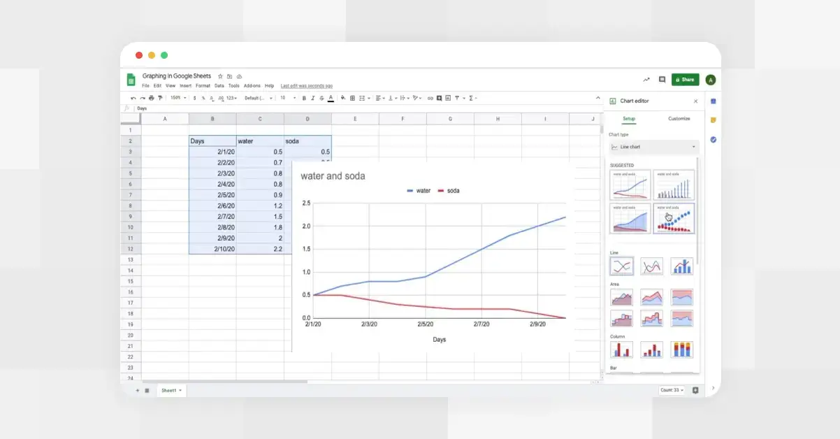 How to Make a Line Graph in Google Sheets
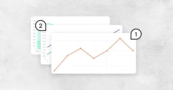 Types of Line Graphs: Quick Guide to Choosing the Right One
 Bar vs Line Graph: When to Use Them For Maximum Impact