Learn about our editorial policies and terms & conditions
- Pie charts show how a whole is divided into parts, with each slice sized to match its share of the total. Only use them when your categories add up to one clear 100 percent and you care about overall proportions more than precise comparisons.
- They work best with two to five distinct categories where one or two slices clearly dominate.
- Avoid them for trends over time, overlapping categories, multi select responses above 100 percent, or slices with very similar values.
- Donut charts follow the same rules as pie charts, but use the hollow center to display a key metric, label, or total.
What is a Pie Chart?
A pie chart is a circular graph that shows how a whole is divided into proportional parts. Each part, also called a slice or sector, represents a category, and the size of the slice reflects how much it contributes to the total. The full circle equals 100 percent, or 360 degrees, so the structure directly mirrors the proportions in your data.
If 40 percent of your budget goes to marketing, that slice takes up 40 percent of the circle. If half of the survey respondents choose Option A, half the pie shows that. The format makes the composition of a dataset immediately clear and shows which categories occupy the most space.
Pie Chart[ˈpī ˌchärt]A pie chart is a circular graph that displays categories as proportional slices of a whole, with each slice sized according to its share of the total value.
Pie charts exist for one purpose: to explain how a whole is divided among categories. They're not meant for comparisons across groups, tracking changes over time, or highlighting small differences. When the question is "What portion does each category take?" a pie chart answers it directly and cleanly.
When to Use a Pie Chart
A pie chart is used when you want to show how different categories contribute up a single whole. That's why they're so common in business dashboards, marketing reports, product breakdowns, and survey analyses. The format clearly highlights the dominant category, which is the primary reason it is chosen.
Common real-world use cases include:
- Business and finance: Breakdowns of revenue by product line, expense distribution, cost centers, budget allocation, or region-based performance.
- Marketing and analytics: Traffic sources, campaign contribution, lead acquisition mix, or share of conversions by channel.
- Product and operations: Ticket types, user types, defect categories, device distribution, or time allocation cross workflows.
- Surveys and research: Answer distribution (for questions that allow only one choice), demographic splits, or category-specific preferences.
The theme is always the same: parts-to-whole relationships. If you're not trying to show that relationship, then a pie usually isn't the right chart for you.
How to Read a Pie Chart
Reading a pie chart is simple and intuitive. Start by reading the title, since it explains what the full circle represents. After that, look for the largest slice. A pie chart naturally draws attention to the category that occupies the most space, and that single slice often answers the main question behind the chart. Then check the labels or percentages to understand the exact share each category holds.
If you notice an "Other" slice, it usually means several small categories have been combined to keep the chart readable. Because it is harder for people to compare the size of wedge-shaped areas than the height of bars, pie charts are ideal for conveying broad proportions rather than precise comparisons. What matters most is the overall proportion each slice takes within the whole.
Parts of a Pie Chart
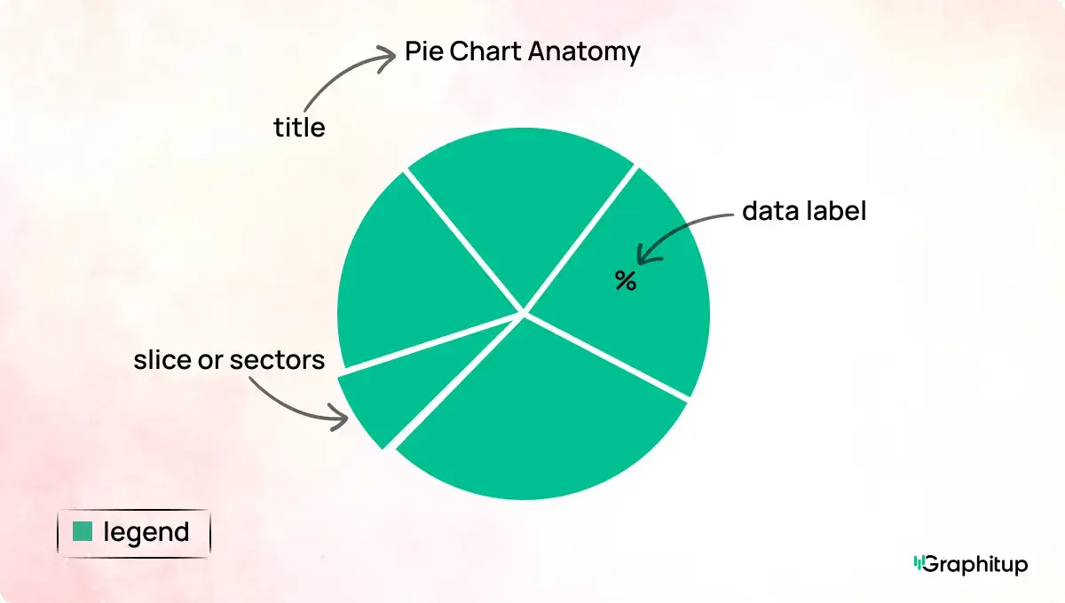
Every pie chart has the following core components:
1. The circle
This represents the entire dataset and stands for 100 percent of whatever you are measuring.
2. Slices or sectors
Each slice shows a category. The size of the slice reflects how much that category contributes to the total.
3. Labels
Labels identify the categories and often include percentages or values. Clear labeling helps the viewer understand each slice without jumping back and forth to a legend.
4. Legend
Some chart tools use a separate legend with color-coded categories. Direct labeling on the slices is usually easier to read, especially in smaller charts.
5. Title
A good title states what the whole represents in a single line. Without this context, the rest of the chart becomes much harder to interpret.
Types of Pie Charts
All pie charts follow the same principle, but a few common variations exist:
Standard pie chart
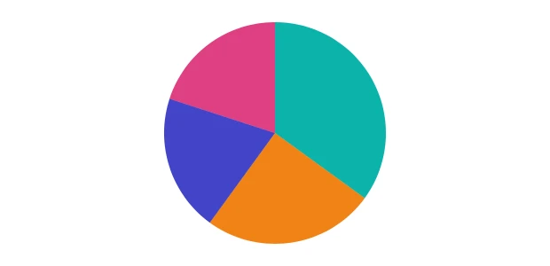
This is the classic version most people know. A single circle is divided into slices, each slice showing a category's percentage of the total. This type works well when you have a small number of categories, and you want people to see which ones take up the most space. Think budget breakdowns, market share, single-choice surveys, or channel distribution for traffic.
Donut chart
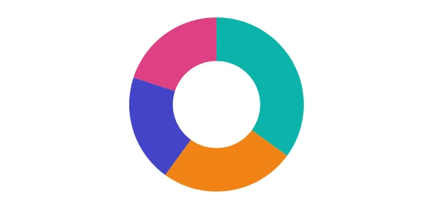
A donut chart is simply a pie chart with the center removed, creating an empty hole in the middle. It functions the same way a pie chart does, but the open center can be used for a total, a category label, or a key metric such as a number or percentage. Some teams prefer donut charts for aesthetics or when they want to place a headline value inside the graphic. They work best when the focus is still on part-to-whole proportions.
Exploded pie chart
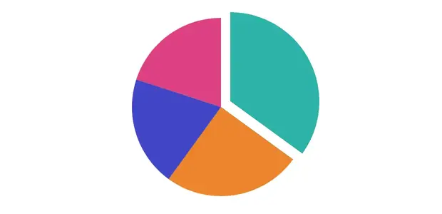
In an exploded pie chart, one or more slices are pulled slightly away from the center. This highlights a single category and draws attention to its importance within the whole. It can be useful for storytelling in presentations, although it should be used sparingly since pulling slices apart makes it harder to compare exact proportions. It is more about emphasis than precision.
Donut Chart vs Pie Chart
A donut chart is a pie chart with the center removed. The shape looks different, but the underlying idea is the same, which is that the slices represent parts of a whole.
Where they differ is in presentation:
- Donut charts create space in the middle. One can place a total, a key metric, or a label inside the hole.
- They can feel cleaner and more modern, especially in dashboards.
- They're slightly easier to read when comparing slice lengths rather than angles.
A pie chart, by contrast, uses the full circle and focuses entirely on slice size. Functionally, both work equally well. The choice often comes down to design preference or space constraints. Explore our Donut Chart Examples or build one in our Donut Chart Maker.
What Data Do You Need for a Pie Chart
Pie charts only require two elements:
- A categorical variable: These are your labels. Examples include channels, regions, product types, or survey options. Each category represents one distinct part of the whole.
- Numerical values that form a complete whole: These values must add up to 100 percent or convert cleanly into percentages. Totals and counts work well because they combine into one full unit. Averages do not, since they don't add up a single total.
These are also two things to avoid, first is to not use overlapping categories. If one item can fall into more than one group, the chart will exceed 100 percent. And the second is to not use averages in place of totals. An average order value by channel, for example, does not describe how the whole is divided. If the data cannot clearly show how one complete value is split up, it is not suitable for a pie chart.
Best Practices for Pie Charts
- Keep the number of slices low. Pies work best with two to five categories. More than five categories can make the slices too small to interpret. If you have more categories, consider grouping the smallest ones into an "Other" slice or switching to a bar chart.
- Order slices deliberately. When categories don't have a natural order, place the largest slice first and work around the circle in descending size. This makes interpretation much easier.
- Label slices clearly. Labels should be visible without searching around. If space is tight, use short labels and percentages.
- Avoid visual distortion. Tilted angles, 3D effects, heavy gradients, and exploded slices all distort proportions and make the chart harder to read. Clean, flat designs work the best.
- Use color with purpose. Choose distinct colors, and avoid repeated hues. If one slice represents the "main story," use a stronger color for it and keep the others neutral.
Should You Use a Pie Chart? (Advantages, Limitations, and When to Avoid It)
Pie charts are powerful in the right context, and deeply misleading in the wrong one. This section will help you decide quickly.
- They make the dominant category obvious.
- They're familiar and easy for non-technical audiences.
- They present a clean, visual part-to-whole story.
- They work well when categories are few and differences are clear.
- Provide quick insights, when time is very limited.
- It's hard to compare slices that have similar values.
- Angles are harder for people to judge than lengths.
- They don't scale to 5-6 categories.
- They can't show change over time.
- They don't compare groups well. Multiple pies make the reader work unnecessarily hard.
When to Avoid Them
Avoid a pie chart when your categories do not add up to one clear total or when the values are so similar that the slices look the same. It also becomes hard to read with more than five or six categories, or when percentages exceed 100 percent, which happens in multi-select surveys. Overlapping categories create the same issue because they inflate the total beyond 100 percent. A pie chart is not suited for trends, group comparisons, or situations where small differences matter more than broad proportions. A simple guideline helps: use a bar chart for comparison and a pie chart to show how one whole is divided.
A good rule of thumb: if the audience needs to compare things, use a bar chart; if they need to see how the whole is divided, a pie chart works.
Bad Pie Chart Examples (And How to Fix Them)
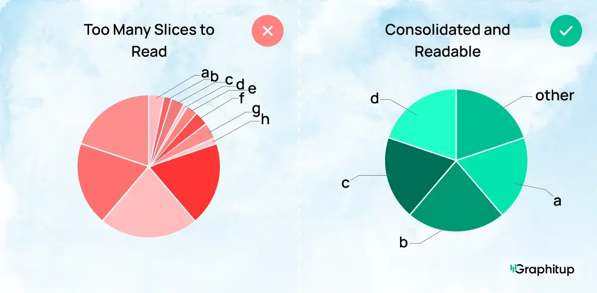
Bad: Too Many Slices to Read
A pie chart with too many categories turns into visual confetti. The viewer cannot tell which slice is which, the colors start repeating, and the entire chart becomes a guessing game instead of a useful graphic. When every slice is tiny, nothing stands out, and the chart fails at its main job: showing which categories take up the most space.
Good: Consolidated to Make Readable
Combining the smallest categories into an "Other" slice instantly makes the chart easier to read. The major categories now stand out, the labels fit cleanly, and the viewer can understand the distribution without squinting.
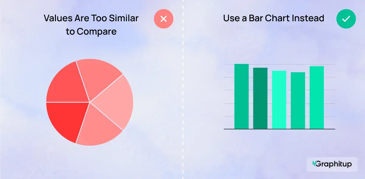
Bad: Values Are Too Similar to Compare
Pie charts struggle when the slices are almost identical in size. The viewer cannot easily tell which category is larger, so the chart adds confusion instead of clarity. With similar values, the entire circle looks evenly divided, and the story is lost.
Good: Use a Bar Chart Instead
When the differences between categories are small, a bar chart makes the comparison obvious. Straight, aligned bars reveal variations that a circular layout hides.
Pie Chart Alternatives
Several chart types tell a clearer story when a pie isn't the right choice:
Bar chart: Best for comparing categories directly. Easier to read than a pie chart and works with many categories.
Stacked bar chart: Shows part-to-whole relationships but makes comparisons across segments possible.
Waffle chart: A grid of 100 squares where each square represents one percent. Great for dashboards and simple proportions.
Donut chart: A stylistic alternative to the pie chart with space to highlight a key metric.
Line chart: For anything involving time or sequences. If you're tempted to use a pie chart for before-and-after comparisons, a line chart will almost always do a better job.
How to Create a Pie Chart
You can make a pie chart in almost any tool, but the workflow varies slightly. While not visually appealing or easy to use, if you prefer to keep your workflow within Excel, you can follow these simple steps. Google sheets works similarly, follow these simple steps.
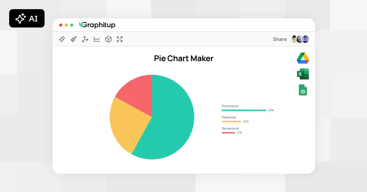
Graphitup provides a more modern, presentation ready, option
that keeps the process straightforward. whether you want a simple image or a fully embeddable chart, you can create it in seconds.
Here's how it works:
- Start by choosing where to build your chart:
- Pie Chart Maker
- Donut Chart Maker
- AI Chart Maker
- Or pick a pre-built pie chart template
- Upload your data (CSV, Excel file, Google Sheets link, or manual entry).
- Customize your chart by adjusting labels, colors, themes, slice order and the layout.
- Export in high resolution or embed it directly in reports and dashboards.
Pie Chart Examples
Pie charts appear across nearly every industry. Examples you'll find in our gallery include:
- Market Share Analysis
- Sales Breakdown by Channel
- Traffic by Channel
- Product Sales Distribution
- Workforce Distribution by Department
- Project Status Report
- Personal Budget Overview
These examples are designed to help you understand both structure and best practice. Plus, using Graphitup they're all easy to recreate.
Create Better Pie Charts With Graphitup
A pie chart only works when the message is simple, the categories are distinct, and the proportions matter. When you use it in the right context, it is one of the fastest ways to show how a whole is divided. Graphitup makes that even easier. You can create clean, properly labeled pie charts, test different layouts, and export them in the exact format you need.
If you want your visuals to look polished without spending time wrestling with design tools, start with the Pie Chart Maker or explore the template gallery and build a chart that communicates the point in seconds.
 Online Pie Chart Maker - Free, No Signup
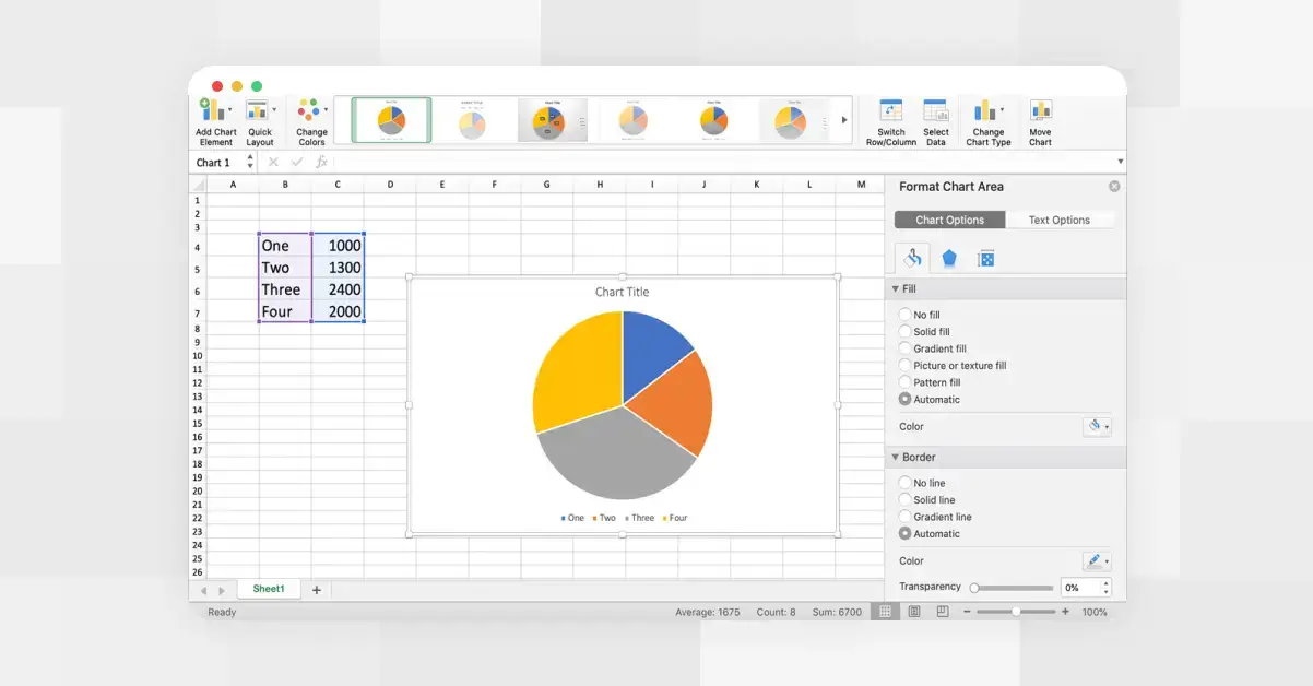 How to Make a Pie Chart in Excel
 How to Make a Pie Chart in Google Sheets